Rich Hainey and I threw this thing together for a "try out" for the MCC A&P lab manual cover. Really, though,...he did all the digital work. Aint it great? The images are my own visual note taking from spring 2011. Rich scanned them in, tinkered away with these magic fingers of his, and vwala, there you have it - a likely winner of the contest. He only took like 2-3 hours making it. sick huh? Zoom in and check it out.
Continue Reading »
Thursday, December 1, 2011
Tuesday, September 6, 2011
Wordclouds
A word cloud is an image of uploaded text presented in a size-to-frequency
expression. for example: if i wrote the word "love" more than the word
"hate," love would appear larger than hate in the word cloud.Such a
representation reveals ones true self, as their most persistent thought
stands out above all else. The first is of a series of writings i called
"randomwritings" that i wrote in when i was 17.The second is my entire 1st
life journal.make one here: http://www.wordle.net/create
Friday, May 20, 2011
norb
This is for a project my friend Greg Webb is in the middle of. It was way fun to make because it's been so long since I worked with oil pastel. But here it is...and soon, Greg will be famous and I can say that I (somewhat) helped him get there. You're welcome, Greg!!! Just messin', dog. Thanx fo yo business! (remember me when you're famous.)
Continue Reading »
Tuesday, March 22, 2011
The Pindar Wedding
"The Pindar Wedding"
Charcoal on frustratingly textured paper, 8x10
This portrait is the smallest I've done in a while (its an 8x10). A friend of mine, John Pindar, just celebrated his anniversary and he wanted to get his wife something extra special. I think a portrait of a couple is one of the most prized, sentimental, romantic things (for lack of a better word) a couple can share.
Continue Reading »
Thursday, March 17, 2011
Tuesday, March 15, 2011
Monday, November 29, 2010
SLC Temple Doors II
This is my new (and much better) version of the SLC Temple doors (size: 14x23). A lot went into this rendition (original seen below), and a lot goes into the prints (above). Like before each is printed on either cavas or a quality art paper then gold-leafed by hand, box-mounted, painted, signed and glossed. Luckily, due to new materials and increased efficiency, I've cut my prices quite a bit. They are now only $150. The price can be altered depending on size, gloss levels and surface (canvas, paper, etc.) The craftsmanship is always enjoyable to look at, but their real quality is in the special spirit they can bring by their presence in a room.
Wednesday, November 3, 2010
John and Raighly (sp, sorry). it was their anniversary so her brother Andrew (Nielsen) commissioned me to make this for them. they were pretty happy with how it came out.
Continue Reading »
Katherine
This is the process of Katherine(my 2nd cousin)'s birthday portrait. She drew one of me so it was only fair that i draw one of her. She is such a good little artist herself and i think one day she may even be famous! her favorite parts of this drawing are: i got her teeth "perfect," the circles, and the "cracks." meda was charcoal, willow charcoal, prismacolor pencil (red), watercolor, gold leaf, light gloss finish.
Continue Reading »
Sunday, August 8, 2010
SLC Temple Doors revisited
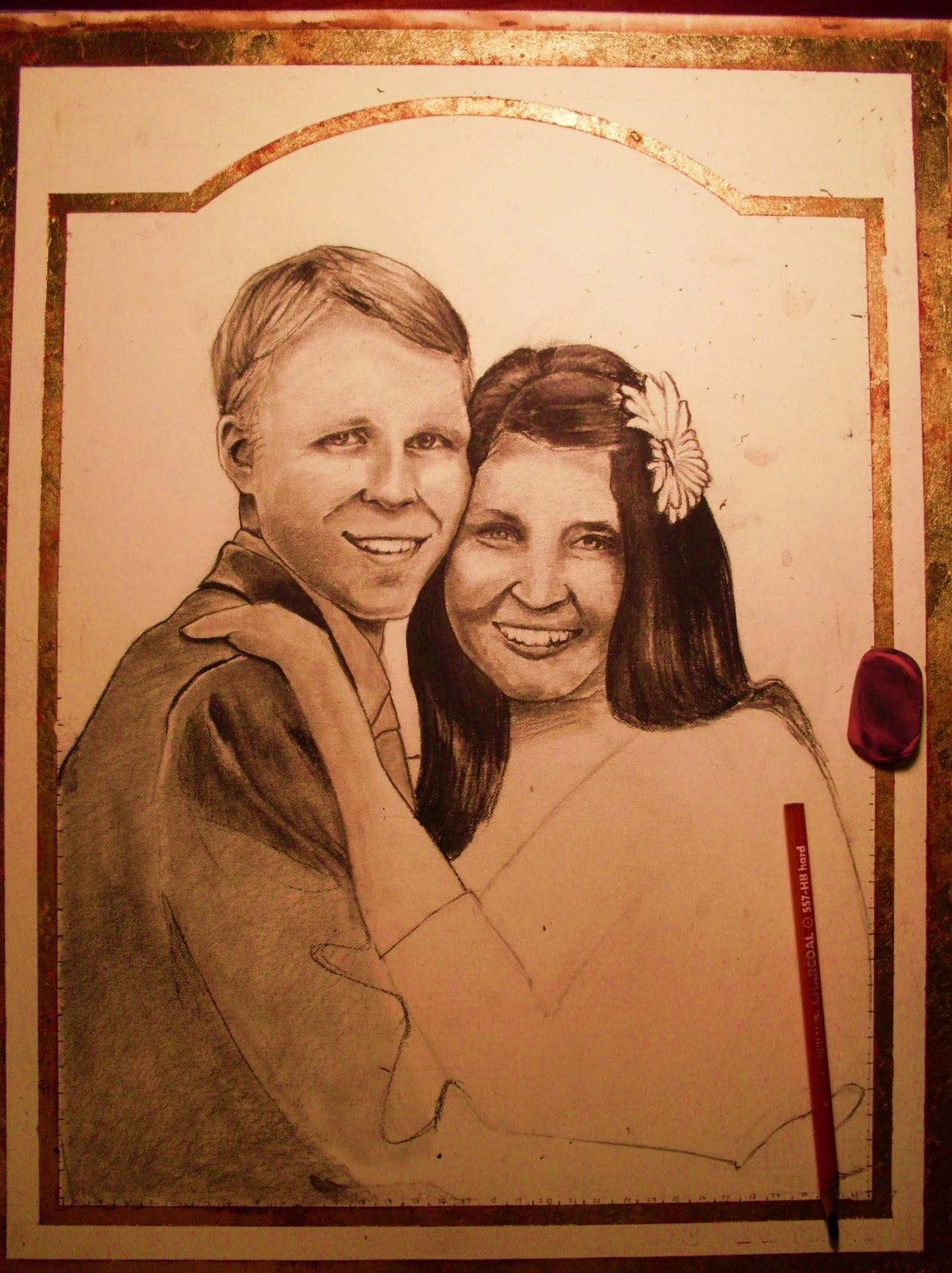
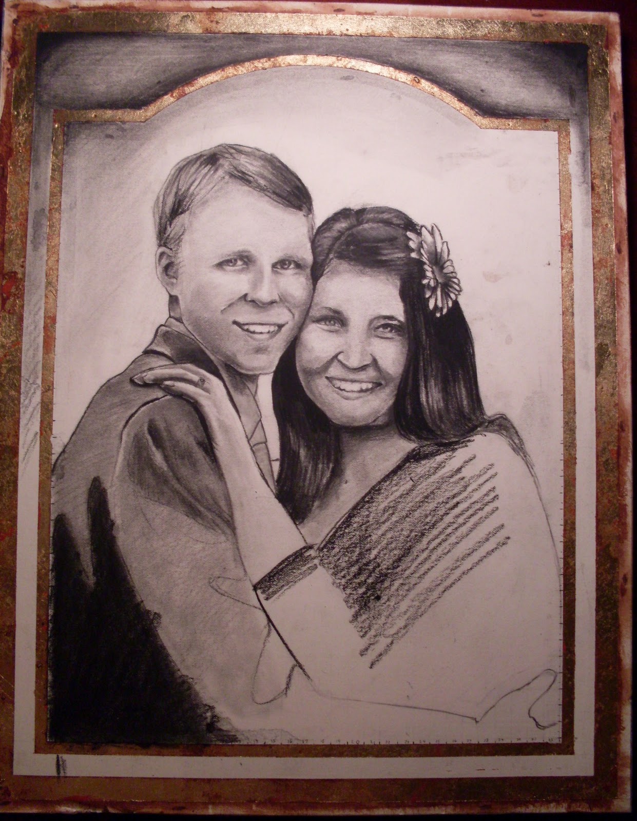
Here's the final product of President Lothaire Bluth's birthday present. if you ask me its much better than the first Temple doors i made. why? because the first was with a graphite based , less manipulatable (is that a word?) media called ebony pencil. this new one was with charcoal-much more potential there for higher contrast, crisper edges, smoother shading and a more correctable drawing...each allow for greater realism. also, the fact that i was making it for someone drove me to greater efforts (and for whom it was for -also a motivation)
MEDIA: charcoal, No 2 pencil, watercolor, 23.5 Karrot gold leafing, Sterling Silver leafing, acrylic paint (black), red pen, Prismacolor colored pencil, mat board, pine and thin particle board (mounting), antique glaze and satin sealer.
and there they are: president Lothaire Bluth and his lovely wife Connie, who commissioned me for the piece. awesome people. extreme art lovers i tell you what!
Continue Reading »
Friday, July 16, 2010
Thursday, May 20, 2010
Madonna de Madera
mother of wood. or is it my lady of wood? the trees in the back ground are very much alive. anything you make using the wood cut from them is alive as well. they and the mother mourn the destuction of the homes around them.
Dust Bowl Mamas
im still wondering what it means. perhaps its on the underappreciated nessesity of motherhood...? i dont know! but perhaps if we break it down we'll discover more about it. the subject in the foregrownd is playing a violin while all the others seem to be working very hard. notice that no one but the other ladies seem to pay any attention to her. perhaps it's because they empathize with unappreciated nurturing (?) every person in the lines is looking down. why? are there not women of startling size right in front of them. is there not beautifull music playing? one does notice. shes the fourth in the forground line to the right. she's a little ecuadorian woman named guadalupe. perhaps shes the only one who sees past being accustomed to a commonality anyone outside of this world depicted would consider strange. why are they taking refuge? is it the vultures? anyway, i dont know all what it means but heres the subjects: motherhood (nurture), work, danger, refuge.
Continue Reading »
Subscribe to:
Comments (Atom)


