This is my new (and much better) version of the SLC Temple doors (size: 14x23). A lot went into this rendition (original seen below), and a lot goes into the prints (above). Like before each is printed on either cavas or a quality art paper then gold-leafed by hand, box-mounted, painted, signed and glossed. Luckily, due to new materials and increased efficiency, I've cut my prices quite a bit. They are now only $150. The price can be altered depending on size, gloss levels and surface (canvas, paper, etc.) The craftsmanship is always enjoyable to look at, but their real quality is in the special spirit they can bring by their presence in a room.
Monday, November 29, 2010
Wednesday, November 3, 2010
John and Raighly (sp, sorry). it was their anniversary so her brother Andrew (Nielsen) commissioned me to make this for them. they were pretty happy with how it came out.
Continue Reading »
Katherine
This is the process of Katherine(my 2nd cousin)'s birthday portrait. She drew one of me so it was only fair that i draw one of her. She is such a good little artist herself and i think one day she may even be famous! her favorite parts of this drawing are: i got her teeth "perfect," the circles, and the "cracks." meda was charcoal, willow charcoal, prismacolor pencil (red), watercolor, gold leaf, light gloss finish.
Continue Reading »
Sunday, August 8, 2010
SLC Temple Doors revisited
Here's the final product of President Lothaire Bluth's birthday present. if you ask me its much better than the first Temple doors i made. why? because the first was with a graphite based , less manipulatable (is that a word?) media called ebony pencil. this new one was with charcoal-much more potential there for higher contrast, crisper edges, smoother shading and a more correctable drawing...each allow for greater realism. also, the fact that i was making it for someone drove me to greater efforts (and for whom it was for -also a motivation)
MEDIA: charcoal, No 2 pencil, watercolor, 23.5 Karrot gold leafing, Sterling Silver leafing, acrylic paint (black), red pen, Prismacolor colored pencil, mat board, pine and thin particle board (mounting), antique glaze and satin sealer.
and there they are: president Lothaire Bluth and his lovely wife Connie, who commissioned me for the piece. awesome people. extreme art lovers i tell you what!
Continue Reading »
Friday, July 16, 2010
Thursday, May 20, 2010
Madonna de Madera
mother of wood. or is it my lady of wood? the trees in the back ground are very much alive. anything you make using the wood cut from them is alive as well. they and the mother mourn the destuction of the homes around them.
Dust Bowl Mamas
im still wondering what it means. perhaps its on the underappreciated nessesity of motherhood...? i dont know! but perhaps if we break it down we'll discover more about it. the subject in the foregrownd is playing a violin while all the others seem to be working very hard. notice that no one but the other ladies seem to pay any attention to her. perhaps it's because they empathize with unappreciated nurturing (?) every person in the lines is looking down. why? are there not women of startling size right in front of them. is there not beautifull music playing? one does notice. shes the fourth in the forground line to the right. she's a little ecuadorian woman named guadalupe. perhaps shes the only one who sees past being accustomed to a commonality anyone outside of this world depicted would consider strange. why are they taking refuge? is it the vultures? anyway, i dont know all what it means but heres the subjects: motherhood (nurture), work, danger, refuge.
Continue Reading »
Wednesday, April 28, 2010
Zac Beus' Business Card Design
another oil pastel! I made all but the lettering. it was diferent! it was fun! hit zac up some time for anything from "solo to small combos for all occasions" (post edited to remove personal number) You are welcome.
Continue Reading »
Friday, April 23, 2010
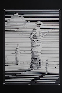
Dust Bowl Mothers I
Made entirely with lines of black Prismacolor marker, Dust Bowl Mothers is done in perhaps my most different style to date. it was a foriegn road from start to finish for me but its been fun. i dont know if ill ever make another like this one....so enjoy it.
Continue Reading »
Wednesday, April 21, 2010
burning olympus cd release: going nowhere
click to hear/buy their music: burningolympus.com
here it is! the finished product! thanx to the assignment of the band "Burning Olympus" i now have another peice to share. These people pictured here are asending from, and descending into the water, thus accomplishing the visual of "Going Nowhere," the name of their cd. of course there is a deeper meaning here than a few guys leaving the water to only enter it again. the 6 people on the left are rising up with more vibrant colors and symbols of life and youth. click on the picture to see the first mans breath, the second w a flag ('A' for alpha, or beginning), a baby, a hiker-for travel and adventure, a green dress and a candle, and a fishing pole. notice also the leaves and birds on the left. The man in the middle is holding a light, whos significance we will discuss hereafter. to his left you will find six symbols of death and or aging. notice the darker duller colors, the beard and gun, the grey hair and cane, the pipe, their reluctance to move foreward, the red flag "Omega" or end, the dark hooded robe, and the last breath of life. on this side there are no leaves, no birds, and look at that setting sun! The middle figure is the seventh from either end, seven being a greek symbol for completion, directing us to where we are complete- not in the past, not in the future, but in the moment. the message is altered slightly to explain the importance of this present time, but not nesisaraly to the completeness found in the middle of ones life we call the prime. it may appear that way...? sorry for the confusion. The light is a symbol of the present. Continue Reading »
Sunday, March 14, 2010
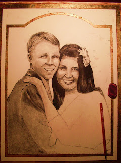
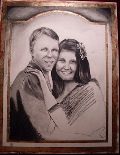
Our aniversary picture: untitled
Ashley Stott is the most amazing beautiful thing in the world. i am a very lucky man to have her. i cant believe its been a year weve been married! last night we were talking about our life together in categories, the funniest moments, the most awkward moments, happiest, saddest, funnest, weirdest, most romantic and "favorite". talking about all this with her got me thinking about how happy i am, not just TO BE with her, but BEING with her. theres a difference between just feeling lucky and thriving. Ashley "thrives" me. she inspired a drawing that ive wanted to make ever since she pointed out her favorite picture of us, courteousy of Taryn Beus, for our engagement. i knew i wanted to make it for her, but you cant jump into a 40 hour peice of art in the middle of school , work, and personal life (wherein hiding the peice is crucial), without it being for a very special occasion. for that occasion ive had to wait.
and here it is, finally. ive been working on it for a couple months now and at last it is complete. Ashley had no idea i was working on this- ive been very sneeky (sir). about every other day of february and march ive been carefully crafting, making it just right. The difference between this one and the other mixed medias (particularly a drawing with watercolor over top) is this one is made of charcoal. i have decided to use charcoal from now on, other than the peices that are already in motion (2). charcoal, i have discovered, allows you to achieve a greater range of values, that is your darks are darker and your whites are whiter (whiter due to its stark contrast to the now darker darks.) it also makes a more real, almost photographic, quality to the subjects depicted. Continue Reading »
and here it is, finally. ive been working on it for a couple months now and at last it is complete. Ashley had no idea i was working on this- ive been very sneeky (sir). about every other day of february and march ive been carefully crafting, making it just right. The difference between this one and the other mixed medias (particularly a drawing with watercolor over top) is this one is made of charcoal. i have decided to use charcoal from now on, other than the peices that are already in motion (2). charcoal, i have discovered, allows you to achieve a greater range of values, that is your darks are darker and your whites are whiter (whiter due to its stark contrast to the now darker darks.) it also makes a more real, almost photographic, quality to the subjects depicted. Continue Reading »
Tuesday, February 9, 2010
naked old men and still lifes
yes he was missing his thumb. sorry for this one...believe it or not, it is edited!
these were from my art class w ted wolter.
Continue Reading »
Monday, February 8, 2010
Phoebe and Bob
Continue Reading »
Burning Olympus- unfinished
my friend chris cooper is having me draw this picture for his bands album cover. "Burning Olympus" is their name and ....music is their game (?) anyway ive already discovered a considerable ammount of what this means to me, but ill wait for it to be complete before i post.
Continue Reading »
Sunday, January 31, 2010
The Most Beautiful Woman In The World
this is what gave my new style (pencil, water color and gld leaf) momentum. i wanted to present it as an antique, and yet contemporary gem. Its my wife, yes i know-hot huh? I drew it for her birthday last October. It shares the same high gloss quality as the mayors home and the temple doors. my school (MCC) sent this to Phoenix to appear in an art show where it receved many compliments and interested buyers...if only i hadn't priced it at $20,000. Ha! are you kidding me? sell my wifes Birthday present? Nope. i guess my attitude was a mix of repelling buyers from taking this special peice, proping myself as a 'hard to get' painter whos stuff is way too expensive for most people, and the famous Jack-in-the-Box saying "All I need is one [buyer to make me rich]!" Ash loved it!
Continue Reading »
On Land or at Sea, or in the Sky are the Sheep?
i just came up with the title...you like it? its another piece of questions. where is the boat? where are the sheep headed? because the stairs portion of this freaky apparatus are on the floor, does this mean that it is on land? or how about the destination of the boat? is it drifting toward an island at sea...or a clowd in the sky? is it even drifting (or firmly planted)? The telephone poles receding toward the horizon shows with certainty the first placement of the subject matter. But then the trees in the clowds? does that show that there's perhaps a peice of land up there? but the connecting point of the stairs and the boat (with the clowds far behind them) show that they are up in the sky. it makes sense if you divide this work in half or in thirds, but as it stands i guess its rather confusing. Why sheep? i dont know, I like sheep i guess. I know it seems a bit unfinished, well it is. I got so darn tired of drawing it!
Continue Reading »
Friday, January 29, 2010
Home Portraits: my new thing
I start with an few pictures: one main one, and a few essential details
fill in the details
begin to shade and fill in shrubbery
apply where you want the red base coat, this will show throught the cracks of the gold leafing
apply special adhesive, let dry, then apply gold leafing
add needed details and antiqueing. Then add water color paint over top.
let dry, mask w/ tape wher you want to put trimming (black). also age the paper w/ drawn-in cracks. mount with spray mounting glue onto 1/4 inch MDF and add wooden trim. paint black.
then glaze and let dry.
Mayor of Gilbert, John Lewis', home. They were so happy with how it turned out. they had Ash and us over for dinner for "The Unveiling." but i forgot my curtain ):
Continue Reading »
Subscribe to:
Comments (Atom)


